Tailwind Css

Hello Folks, In this article I am Writing about basics of Tailwind CSS
Tailwind CSS is basically a utility-first CSS framework for rapidly building custom user interfaces. It is a highly customizable, low-level CSS framework that gives you all of the building blocks you need to build bespoke designs without any annoying opinionated styles you have to fight to override.
Installation
Using this below CDN Link in our HTML head we can start working with Tailwind CSS.
<script src="https://cdn.tailwindcss.com"></script>
Customize
By editing Tailwind.config Object in head of HTML, we can customize with our own design tokens.
<script>
    tailwind.config = {
      theme: {
        extend: {
          colors: {
            clifford: '#da373d',
          }
        }
      }
    }
  </script>
Utility First
Traditionally while developing a basic page in web development, we write HTML code, to that HTML code we will add classes so that we can apply CSS and design website.But in Tailwind CSS we will be using
pre existing classesand apply that to our HTML.
Example
<div class="p-6 max-w-sm mx-auto bg-white rounded-xl shadow-lg flex items-center space-x-4">
  <div class="shrink-0">
    <img class="h-12 w-12" src="/img/logo.svg" alt="ChitChat Logo">
  </div>
  <div>
    <div class="text-xl font-medium text-black">ChitChat</div>
    <p class="text-slate-500">You have a new message!</p>
  </div>
</div>
Output

In the example above, we’ve used:
Tailwind’s flexbox and padding utilities (flex, shrink-0, and p-6) to control the overall card layout
The max-width and margin utilities (max-w-sm and mx-auto) to constrain the card width and center it horizontally
The background color, border radius, and box-shadow utilities (bg-white, rounded-xl, and shadow-lg) to style the card’s appearance
The width and height utilities (w-12 and h-12) to size the logo image
The space-between utilities (space-x-4) to handle the spacing between the logo and the text
The font size, text color, and font-weight utilities (text-xl, text-black, font-medium, etc.) to style the card text
Responsive Design
Every utility class in Tailwind can be applied conditionally at different breakpoints, which makes it a piece of cake to build complex responsive interfaces without ever leaving your HTML. There are five breakpoints by default, inspired by common device resolutions:
sm 640px @media (min-width: 640px) { ... }
md 768px @media (min-width: 768px) { ... }
lg 1024px @media (min-width: 1024px) { ... }
xl 1280px @media (min-width: 1280px) { ... }
2xl 1536px @media (min-width: 1536px) { ... }
To add a utility but only have it take effect at a certain breakpoint, all you need to do is prefix the utility with the breakpoint name, followed by the : character:
<!-- Width of 16 by default, 32 on medium screens, and 48 on large screens -->
<img class="w-16 md:w-32 lg:w-48" src="...">
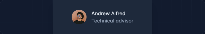
Flex
By defining flex we can create a block-level flex container.
<div class="flex items-center">
  <img src="path/to/image.jpg">
  <div>
    <strong>Andrew Alfred</strong>
    <span>Technical advisor</span>
  </div>
</div>
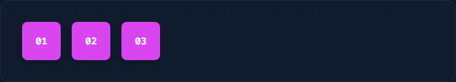
Flex Direction
flex-row

flex-row-reverse

flex-col

flex-col-reverse
- Row
By using flex-row we can position flex items horizontally in the same direction.
<div class="flex flex-row ...">
  <div>01</div>
  <div>02</div>
  <div>03</div>
</div>
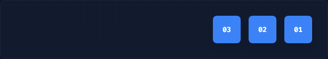
- Row Reverse
By using flex-row-reverse we can position flex items horizontally in the opposite direction.
<div class="flex flex-row-reverse ...">
  <div>01</div>
  <div>02</div>
  <div>03</div>
</div>
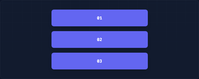
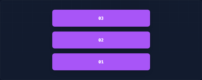
3.Column
By using flex-col we can position flex items position flex items vertically.
<div class="flex flex-col ...">
  <div>01</div>
  <div>02</div>
  <div>03</div>
</div>
4.Column-reverse
By using flex-col-reverse position flex items position flex items vertically in reverse direction.
<div class="flex flex-col-reverse ...">
  <div>01</div>
  <div>02</div>
  <div>03</div>
</div>
Flex Basis
By using the flex basis-{size} we can set the utilities to initial size of flex items.
<div class="flex flex-row">
  <div class="basis-1/4">01</div>
  <div class="basis-1/4">02</div>
  <div class="basis-1/2">03</div>
</div>
Grid
By defining grid we can create a grid container.
<div class="grid gap-4 grid-cols-3 grid-rows-3">
  <!-- ... -->
</div>
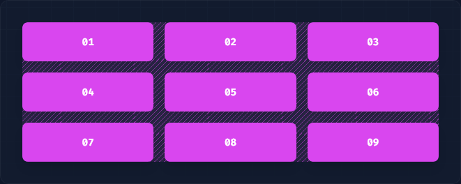
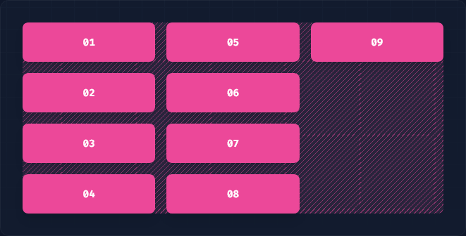
Grid Template Columns
By using the grid-cols-{n} in utilities to create grids with n equally sized columns
<div class="grid grid-cols-4 gap-4">
  <div>01</div>
  <!-- ... -->
  <div>09</div>
</div>
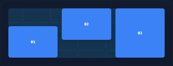
Grid Column Start/End
By using the col-start-{n} and col-end-{n} in utilities to make an element start or end at the nth grid line. These can also be combined with the col-span-{n} utilities to span a specific number of columns.
In CSS grid lines start at 1, not 0, so a full-width element in a 6-column grid would start at line 1 and end at line 7.
<div class="grid grid-cols-6 gap-4">
  <div class="col-start-2 col-span-4 ...">01</div>
  <div class="col-start-1 col-end-3 ...">02</div>
  <div class="col-end-7 col-span-2 ...">03</div>
  <div class="col-start-1 col-end-7 ...">04</div>
</div>
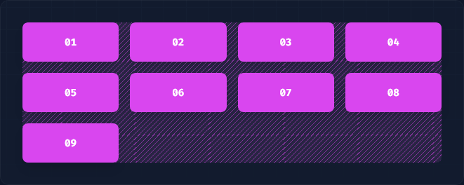
Grid Template Rows
By using the grid-rows-{n} in utilities to create grids with n equally sized rows.
<div class="grid grid-rows-4 grid-flow-col gap-4">
  <div>01</div>
  <!-- ... -->
  <div>09</div>
</div>
Grid Row Start / End
By using the row-start-{n} and row-end-{n} in utilities to make an element start or end at the nth grid line. These can also be combined with the row-span-{n} utilities to span a specific number of rows.
In CSS grid lines start at 1, not 0, so a full-height element in a 3-row grid would start at line 1 and end at line 4.
<div class="grid grid-rows-3 grid-flow-col gap-4">
  <div class="row-start-2 row-span-2 ...">01</div>
  <div class="row-end-3 row-span-2 ...">02</div>
  <div class="row-start-1 row-end-4 ...">03</div>
</div>
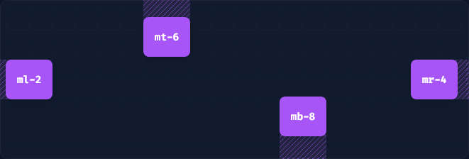
Margins
Control the margin on one side of an element using the m{t|r|b|l}-{size} utilities.
For example, mt-6 would add 1.5rem of margin to the top of an element, mr-4 would add 1rem of margin to the right of an element, mb-8 would add 2rem of margin to the bottom of an element, and ml-2 would add 0.5rem of margin to the left of an element.
<div class="mt-6 ...">mt-6</div>
<div class="mr-4 ...">mr-4</div>
<div class="mb-8 ...">mb-8</div>
<div class="ml-2 ...">ml-2</div>
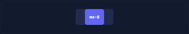
Horizontal margin
Control the horizontal margin of an element using the mx-{size} utilities.
<div class="mx-8 ...">mx-8</div>
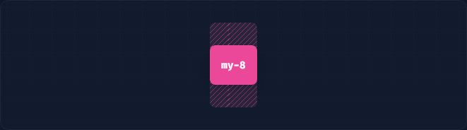
Vertical Margin
Control the vertical margin of an element using the my-{size} utilities.
<div class="my-8 ...">my-8</div>
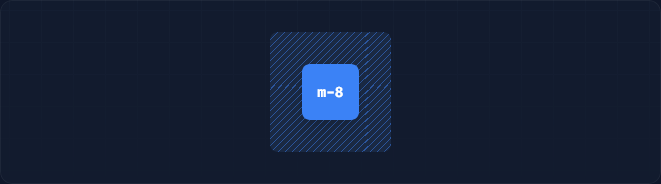
Margin to all sides
Control the margin on all sides of an element using the m-{size} utilities.
<div class="m-8 ...">m-8</div>
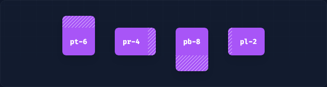
Padding
Control the padding on one side of an element using the p{t|r|b|l}-{size} utilities.
For example, pt-6 would add 1.5rem of padding to the top of an element, pr-4 would add 1rem of padding to the right of an element, pb-8 would add 2rem of padding to the bottom of an element, and pl-2 would add 0.5rem of padding to the left of an element.
<div class="pt-6 ...">pt-6</div>
<div class="pr-4 ...">pr-4</div>
<div class="pb-8 ...">pb-8</div>
<div class="pl-2 ...">pl-2</div>
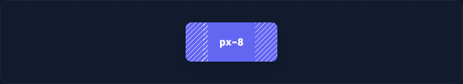
Horizontal Padding
Control the horizontal padding of an element using the px-{size} utilities.
<div class="px-8 ...">px-8</div>
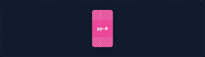
Vertical Padding
Control the vertical padding of an element using the py-{size} utilities.
<div class="py-8 ...">py-8</div>
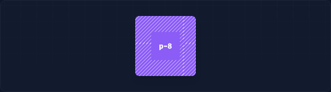
Padding on all sides
Control the padding on all sides of an element using the p-{size} utilities.
<div class="p-8 ...">p-8</div>
Justify Content
Utilities for controlling how flex and grid items are positioned along a container's main axis.
1.Start
Use justify-start to justify items against the start of the container’s main axis.
<div class="flex justify-start ...">
  <div>01</div>
  <div>02</div>
  <div>03</div>
</div>
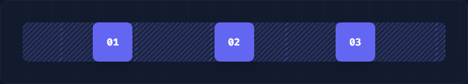
2.Center
Use justify-center to justify items along the center of the container’s main axis.
<div class="flex justify-center ...">
  <div>01</div>
  <div>02</div>
  <div>03</div>
</div>
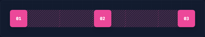
3.End
Use justify-end to justify items against the end of the container’s main axis.
<div class="flex justify-end ...">
  <div>01</div>
  <div>02</div>
  <div>03</div>
</div>
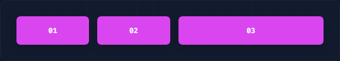
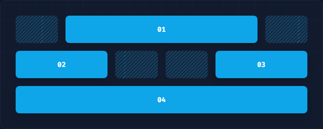
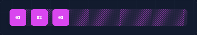
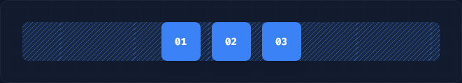
4.Space Between
Use justify-between to justify items along the container’s main axis such that there is an equal amount of space between each item.
<div class="flex justify-between ...">
  <div>01</div>
  <div>02</div>
  <div>03</div>
</div>
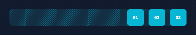
5.Space Around
Use justify-around to justify items along the container’s main axis such that there is an equal amount of space on each side of each item.
<div class="flex justify-around ...">
  <div>01</div>
  <div>02</div>
  <div>03</div>
</div>

6.Space Evenly
Use justify-evenly to justify items along the container’s main axis such that there is an equal amount of space around each item.
<div class="flex justify-evenly ...">
  <div>01</div>
  <div>02</div>
  <div>03</div>
</div>
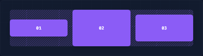
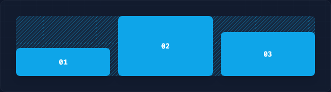
Align Items
Utilities for controlling how flex and grid items are positioned along a container's cross axis.
1.Start
Use items-start to align items to the start of the container’s cross axis.
<div class="flex items-start ...">
  <div class="py-4">01</div>
  <div class="py-12">02</div>
  <div class="py-8">03</div>
</div>
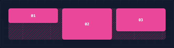
2.Center
Use items-center to align items along the center of the container’s cross axis.
<div class="flex items-center ...">
  <div class="py-4">01</div>
  <div class="py-12">02</div>
  <div class="py-8">03</div>
</div>
3.End
Use items-center to align items along the center of the container’s cross axis.
<div class="flex items-end ...">
  <div class="py-4">01</div>
  <div class="py-12">02</div>
  <div class="py-8">03</div>
</div>
To learn more about Tailwind CSS read this Tailwind Documentation


